Sometimes the best tool is the one that gets out of your way.
Open the App Store and search for “planner.” You’ll find dozens of apps, each with a feature list long enough to fill a small novel. AI scheduling. Habit tracking. Pomodoro timers. Kanban boards. Note-taking. Mind maps. Project management. Collaboration tools. Some of them try to do all of this at once.
At some point, you have to wonder: when did planning your week become so complicated?
The feature race nobody asked for
There’s a pattern in the app world that’s hard to miss. A new planner app launches with a clean, focused design. People love it. Reviews pour in. Then, over time, the updates start rolling out — a new integration here, a new view there, a dashboard nobody requested but the roadmap demanded. Before long, the app that once felt like a breath of fresh air starts to feel like a cockpit.
This isn’t unique to planner apps. It happens across software. But it feels especially ironic in the planning space, where the whole point is to bring clarity to your day. If you need 20 minutes to learn how your planner works, something has gone sideways.
The instinct behind feature accumulation is understandable. Developers want to serve more users. Marketing teams want bullet points for the App Store listing. Investors want growth metrics. Every new feature is a potential hook for a new audience segment. On paper, it makes perfect sense.
In practice, it often makes the app worse for the people already using it.
What actually happens when you plan
Think about what planning really looks like in your daily life. You sit down — maybe in the morning, maybe Sunday evening — and you think about what matters this week. You write things down. You might sketch out your schedule, jot a few priorities, or scribble a reminder in the margin. The act is simple, almost meditative. It’s a conversation between you and the page.
That conversation doesn’t need artificial intelligence. It doesn’t need a built-in habit tracker or a Pomodoro timer counting down in the corner. It needs space, a good writing experience, and just enough structure to keep you oriented.
There’s actually research to support this. Studies on handwriting and cognition consistently show that the physical act of writing — the slow, deliberate movement of forming words — engages the brain differently than typing. It aids memory. It clarifies thinking. It makes the act of planning more than just data entry.
This is why so many people still love paper planners, even in 2026. Not because paper is technologically superior — obviously it isn’t — but because paper gets out of the way. It doesn’t ping you. It doesn’t suggest you try a new workflow. It just sits there, ready for your pen.
The question for digital planners, then, isn’t “how many features can we add?” It’s “how close can we get to that feeling — while offering the things paper genuinely can’t do?”
The features that actually matter
If you strip away the noise, what does a digital planner actually need to earn its place over a paper one?
A great writing experience. This is non-negotiable. If the app doesn’t feel good to write in — if there’s lag, if the palm rejection is unreliable, if the ink doesn’t look natural — then nothing else matters. You won’t use it.
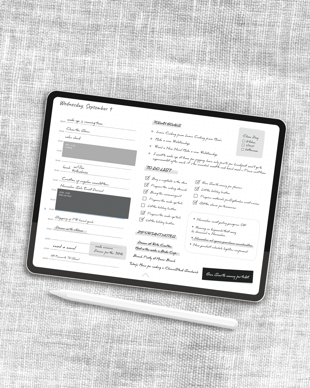
Templates that provide structure without rigidity. A weekly spread. A daily page. Maybe a monthly overview. These are the bones of any planner, and they should be well-designed and easy to navigate. But you shouldn’t need a tutorial to figure out how to switch between them.
A way to see your existing schedule. This is one of the few areas where digital genuinely outshines paper. If your planner can display your calendar events — the meetings, the appointments, the deadlines already living in Apple Calendar or Google Calendar — then you can plan around reality rather than trying to remember it. It doesn’t need to be a full calendar app. It just needs to show you what’s already on your plate.
Stamps, stickers, and small visual touches. This might sound trivial, but it’s not. The ability to drop a small icon next to a task, mark a page with a color, or add a decorative element — these are the digital equivalents of the washi tape and colored pens that paper planner enthusiasts swear by. They make the planner feel like yours.
That’s it. That’s the list.
You don’t need AI to tell you what to do today. You already know. You don’t need a built-in note-taking system when you already have one. You don’t need project management features unless you’re actually managing a project team — and if you are, you probably have a dedicated tool for that already.
The cost of too many features
Feature bloat isn’t just an aesthetic problem. It has real costs.
Cognitive load. Every button, every menu option, every toggle is a micro-decision. Do I use the Kanban view or the list view? Should I set a priority level? Do I need to tag this? These decisions might seem small, but they accumulate. And they pull you away from the one thing you sat down to do: think about your day and write it down.
Performance. More features mean more code, more data, more syncing. Apps that try to do everything often feel sluggish on older devices. Your planner should open instantly and respond to your pencil without hesitation. Speed is a feature — arguably the most important one.
Learning curve. A planner should be immediately intuitive. If you’re watching YouTube tutorials to figure out how to use it, that’s a red flag. The best tools feel familiar the moment you pick them up.
Subscription fatigue. Many feature-heavy apps justify their complexity with a subscription model. After all, maintaining dozens of features requires ongoing development. But do you really want to pay monthly for features you don’t use? There’s something appealing about a tool that does a few things well and charges you fairly for it.
A different philosophy
I think about this a lot, because I build a planner app.
Planner for iPad started from a simple idea: what if a digital planner could feel as natural as a paper one? Not as a stepping stone to something bigger and more complex, but as a destination. An app that respects the simplicity of the planning ritual rather than trying to reinvent it.
So it focuses on handwriting with Apple Pencil. It has templates — weekly, daily, monthly — that you can flip through the way you’d flip through a physical planner. It shows your Apple Calendar and Google Calendar events right on the page, so you can see your schedule without switching apps. And it has stamps and stickers to make your pages feel personal.
That’s the core of it. No AI assistant. No built-in habit tracker. No Kanban boards or Gantt charts or collaboration features. Not because those things are bad — they’re genuinely useful in the right context — but because they don’t belong in a planner. A planner is a personal space for thinking and writing. It should feel calm, not busy.
This philosophy isn’t for everyone, and that’s fine. If you need a full productivity suite, there are excellent options out there. But if you’ve ever felt overwhelmed by your planning app — if you’ve ever opened it, stared at the interface, and closed it again because it felt like too much — then maybe what you need isn’t more features. Maybe what you need is fewer.
The luxury of simplicity
There’s a Japanese concept called ma (間) — the idea that emptiness and space are not absence, but presence. The pause between musical notes is what gives the melody its shape. The white space on a page is what makes the text readable. The room to breathe is what makes a space livable.
I think the same principle applies to tools. The features an app doesn’t have can be just as important as the ones it does. Empty space in an interface isn’t wasted space — it’s room for your own thoughts. A planner that doesn’t try to do everything is giving you permission to just plan.
The next time you’re evaluating planner apps, try this: instead of comparing feature lists, ask yourself a simpler question. Does this app make me want to sit down and write?
If the answer is yes, you’ve probably found the right one — no matter how short its feature list is.