There’s a quiet ritual that millions of people in Japan practice every day. They open a notebook — not a phone, not a laptop — and they write. They plan their week in careful handwriting, decorate margins with tiny stickers, and turn the simple act of scheduling into something almost meditative. This is techo culture, and it’s one of the most beautiful productivity traditions in the world.
Planner for iPad was born from this tradition.
What Is Techo Culture?
Every autumn in Japan, something remarkable happens. Department stores and stationery shops fill entire floors with planners. People line up to compare layouts, paper textures, and cover designs. The annual planner — or techo (手帳) — isn’t just a tool. It’s a companion for the year ahead.
Brands like Hobonichi, Jibun Techo, and Traveler’s Notebook have turned paper planning into an art form. Their designs share a common philosophy: give users a clean, minimal structure and let them make it their own. No clutter, no overengineering. Just thoughtful blank space, waiting for ink.
This is radically different from the Western approach to productivity apps, which tend to pile on features, toggles, and integrations until the tool itself becomes a project to manage. Japanese techo culture takes the opposite path — it trusts the user’s hand and mind to do the organizing.
Why Most Digital Planners Miss the Point
If you’ve ever tried to replace a paper planner with a digital one, you probably felt something was off. Most digital planning tools fall into two camps, and neither captures what makes analog planning special.
The first camp is task management apps. They’re powerful, but they feel like work. Opening one doesn’t give you the same sense of calm focus that opening a beautiful notebook does. There’s no warmth, no personal touch, no sense that this space is yours.
The second camp is PDF planner templates used inside note-taking apps like GoodNotes. These recreate the look of a paper planner, but they’re static. You have to download templates, set up pages manually, link tabs by hand, and live with someone else’s layout decisions. They look like planners, but they don’t feel like planners — they feel like workarounds.
Planner for iPad exists because neither camp honors the thing that makes techo culture work: the seamless blend of beautiful simplicity and practical function.
No Templates. No Setup. Just Open and Write.
When you launch Planner for iPad, you’re greeted by a clean, minimal interface — a dated planner page, ready for your Apple Pencil. There’s no setup wizard, no template store to browse, no configuration to fuss over. The planner is already there, fully formed, the way a Hobonichi Techo is ready the moment you open its cover.
This is a deliberate design choice inspired by the Japanese techo philosophy: the tool should disappear so the experience can begin.
Every page is undated by default in the sense that the structure adapts — your weekly view, monthly view, and daily spaces all flow naturally from the calendar. You don’t build the planner. You simply use it.
Where Analog Soul Meets Digital Capability
Here’s where Planner for iPad goes beyond what any paper techo can offer, without sacrificing the analog feeling.
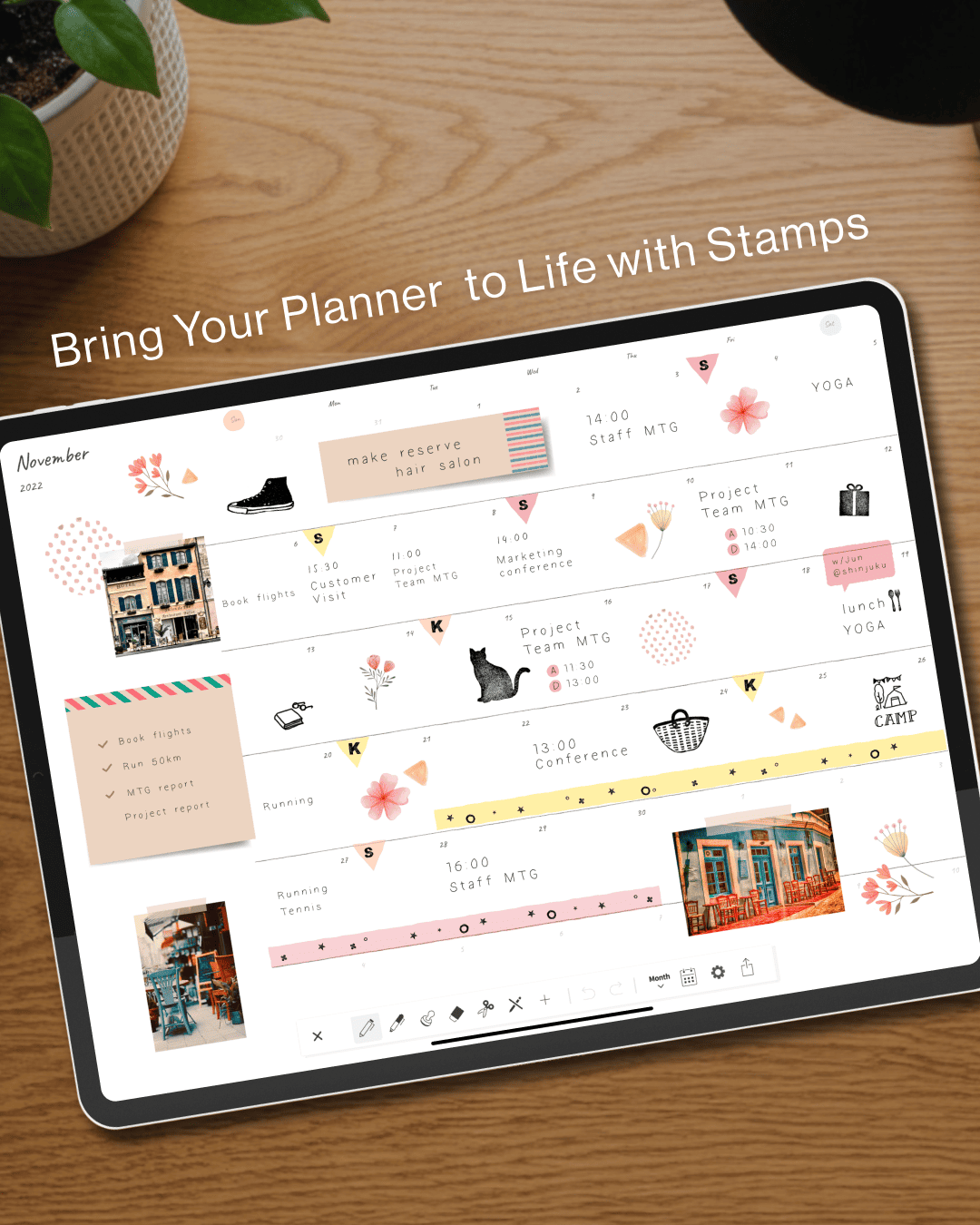
Calendar integration. Your existing Apple Calendar events appear right inside your planner pages. You see your schedule in your own handwriting space, alongside the appointments you’ve already committed to digitally. No double-entry. No switching between apps to cross-reference your day. This is the single most important feature that separates Planner for iPad from every PDF template on the market — and it’s the kind of quiet, practical magic that techo culture would approve of.
Apple Pencil-first design. Every interaction is optimized for the stylus. Writing in Planner for iPad feels like writing in a real notebook — responsive, fluid, and natural. The app doesn’t fight your hand the way many note-taking apps do when you try to use them as planners.
Blur export for privacy. Paper planners have a natural advantage: you can photograph a beautifully decorated page to share on Instagram without anyone reading your private notes. Planner for iPad recreates this with a blur export feature. Share your planner aesthetic without oversharing your life. It’s a small, thoughtful detail — exactly the kind of thing Japanese product design is known for.
Decoration without distraction. Stickers, stamps, and washi tape effects let you personalize your pages the way techo enthusiasts decorate their analog planners. But these elements are curated and tasteful, never overwhelming. The goal is self-expression within a calm framework, not a craft project that takes longer than the planning itself.
Minimalism Is Not Emptiness
One of the most misunderstood ideas in design is minimalism. People assume it means removing things until nothing is left. Japanese design — from techo culture to architecture to cuisine — teaches a different lesson: minimalism means removing everything that doesn’t serve the experience, so that what remains can be felt more deeply.
Planner for iPad follows this principle. There are no feature-count bragging rights here. No AI assistants trying to plan your life for you. No social feeds. No gamification. Just a beautifully simple digital notebook that respects your time, your handwriting, and your way of thinking.
In a world of apps that demand your attention, Planner for iPad is one that simply holds space for it.
A Planner for People Who Love Planners
If you’re the kind of person who lingers in the stationery aisle, who watches techo setup videos on YouTube, who believes that the act of writing things down by hand changes how you think — Planner for iPad was made for you.
It’s not trying to replace your paper techo. It’s trying to bring that same feeling — the warmth, the ritual, the beauty of a well-kept notebook — into the iPad you already carry everywhere.
Plan on paper. Connect like an app.